Kenvue became my main client around 2023. Most of what we did for them was executional, so this section is more intended to show how I can flex my writing style and strategic thinking across a variety of challenges and product categories. Starting with one project that provided fun challenges every step of the way.
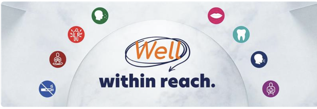
This KV was the result of several rounds of creative development for a complicated Kenvue program. It was one of those fun combinations of competing communication priorities.
Communicate that Kenvue’s value comes from its efficacy.
Communicate accessibility.
Imply that Kenvue fits within any budget…
…but Kenvue is actually on the pricier side, so don’t say it’s cheap or affordable.
Communicate effectiveness of care products without implying that these products eliminate the need for medical care.
Don’t say the word ‘health’.
We liked where we landed with the language. It hit on all the required priorities in a nice, succinct, conversational way that didn’t toe any tricky legal lines. And then…
…one of our account folks stumbled on this ad from a competing company, quite literally at the very last minute. Client had approved the work, and we were about to go into production.
The solution I came up with was a line that both implied the result of Kenvue’s line of personal care products, as well as a competitive claim to quality for the umbrella brand itself, that would also allow for pulse period flexibility—something that’s not always asked for at the outset of a campaign, but we know will come eventually.
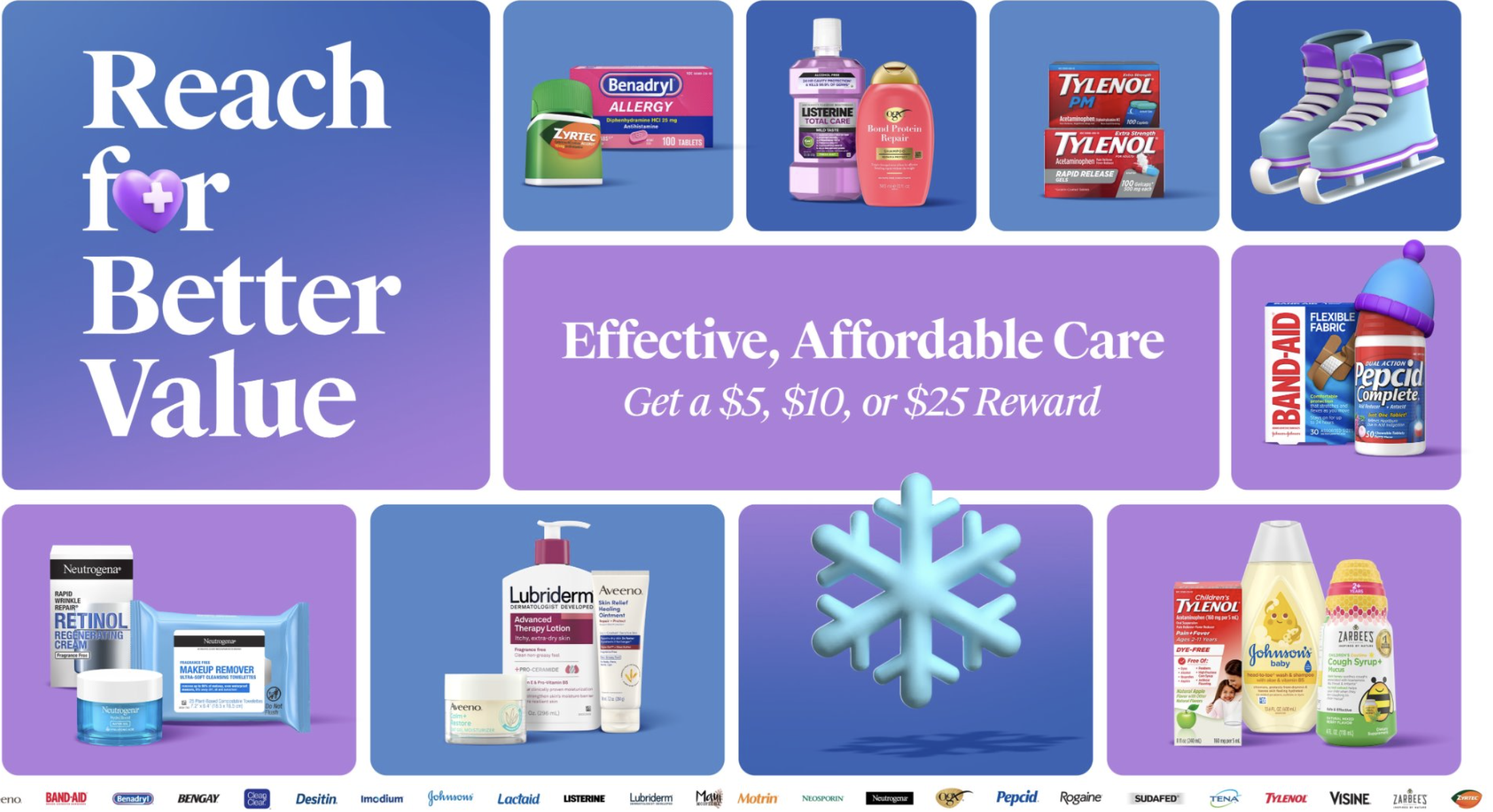
I thought this project served as a good microcosm of the kind of work I did during my time on Kenvue. Distillation of heavy strategy, walking a tight rope of legal constraints and linguistic limitations, while still trying to deliver a creatively satisfying end-product.
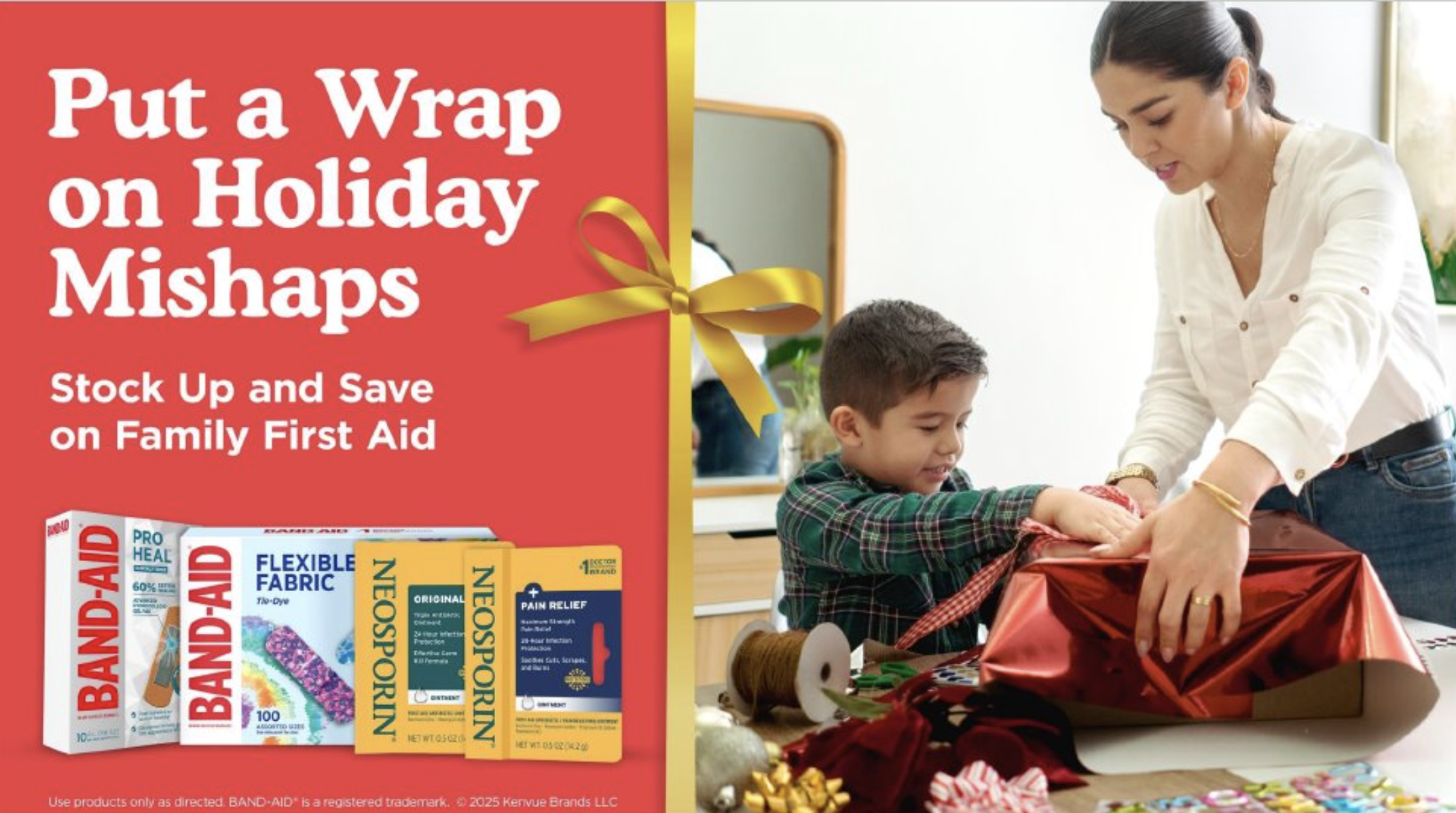
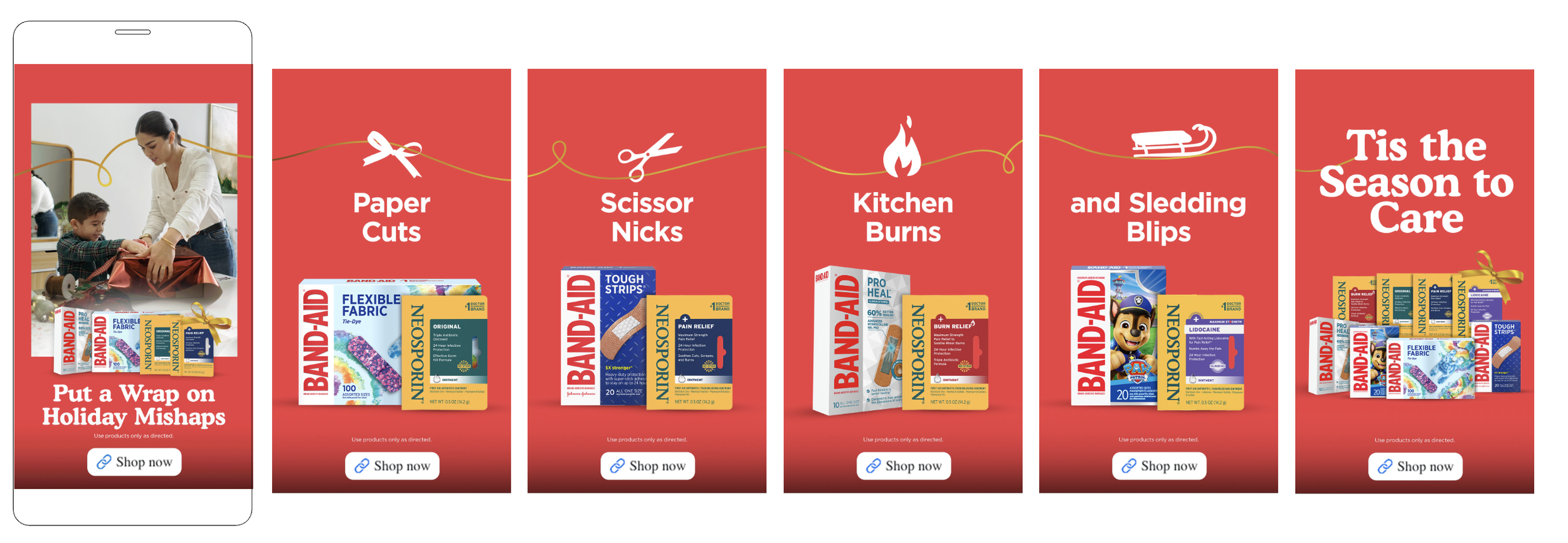
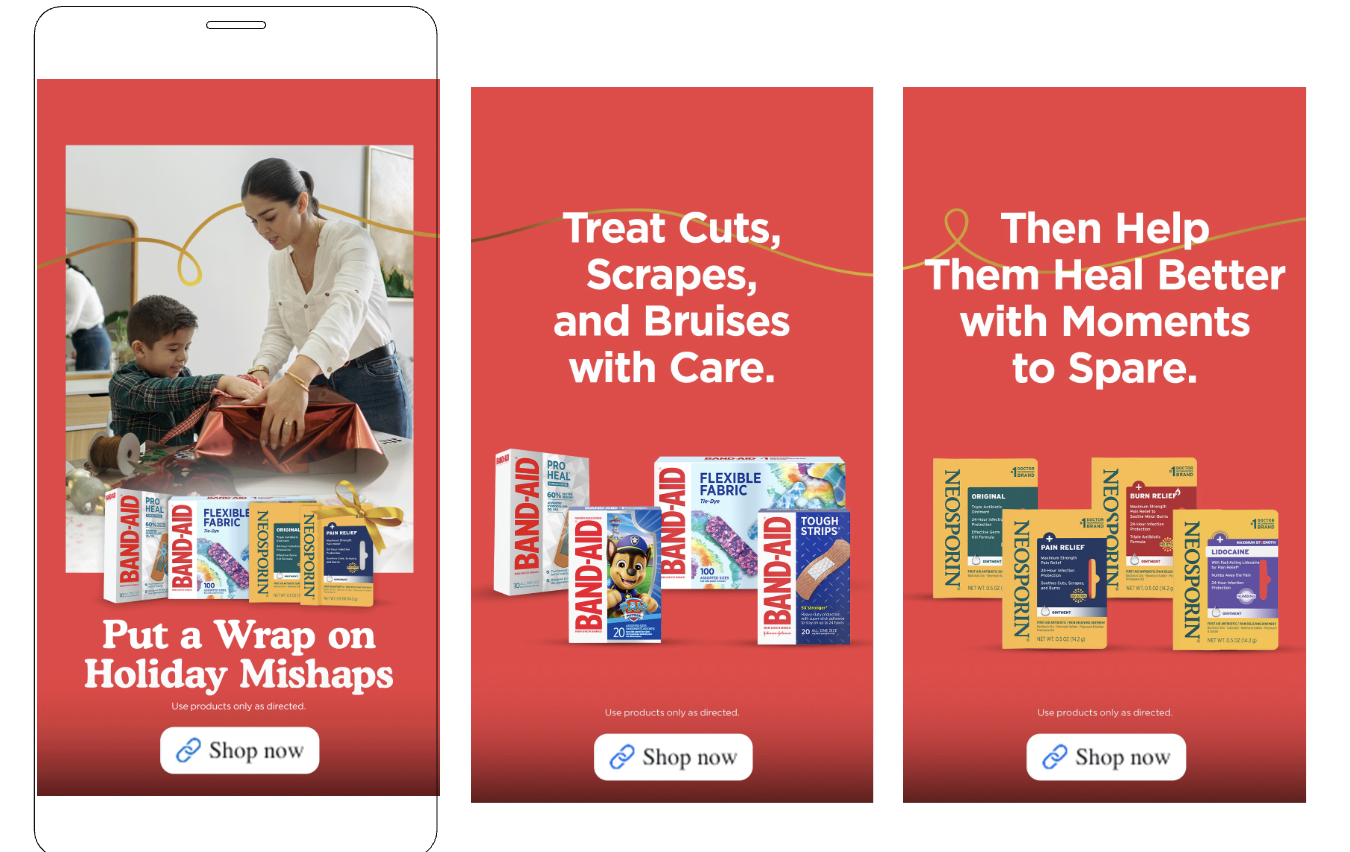
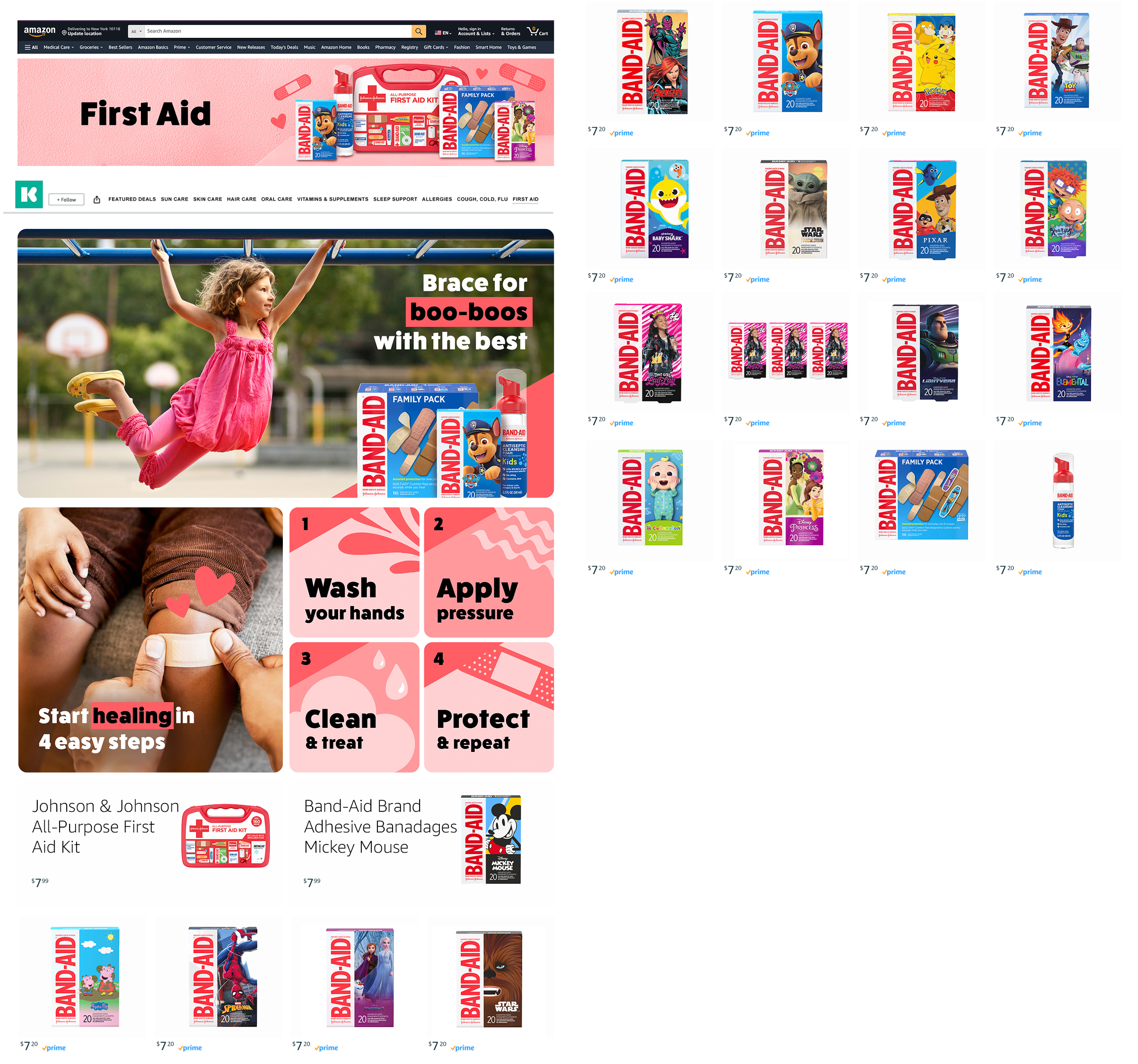
Next up, a Band-Aid project aiming to remind consumers to be prepared for holiday wound care before the season gets underway. Challenge here is, how do you keep the work fun and holiday friendly while still speaking to the fairly serious problem it’s designed to solve? “For When Your Kid Inevitably Sticks an Ornament Hook In Their Thumb” probably wasn’t going to cut it.
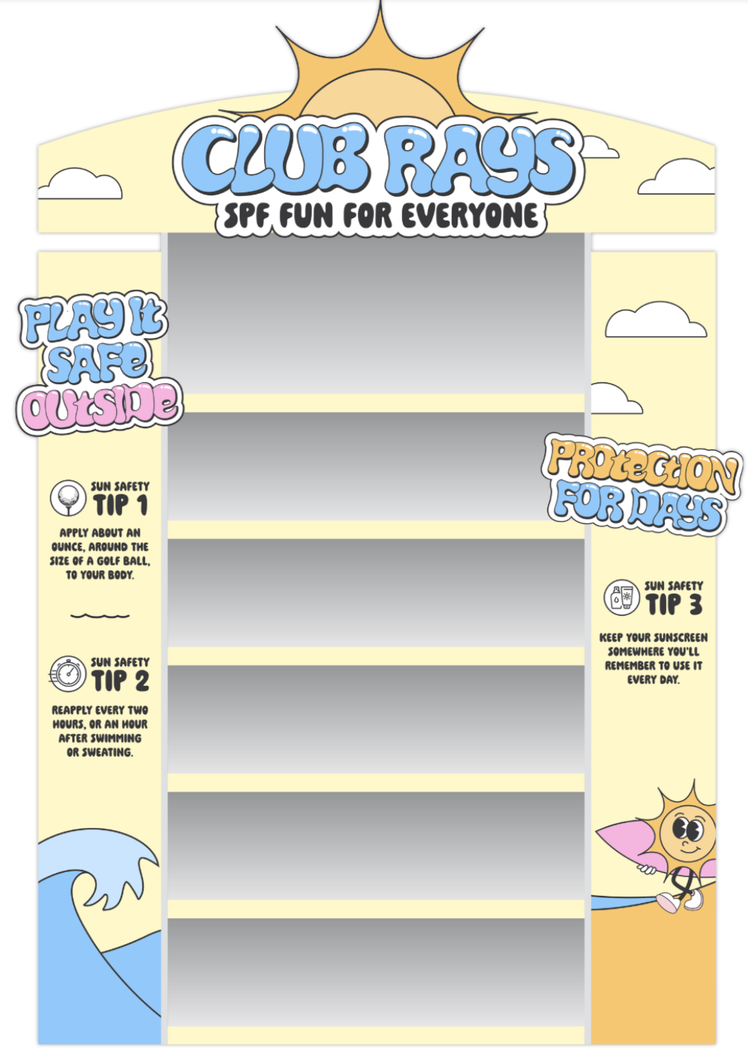
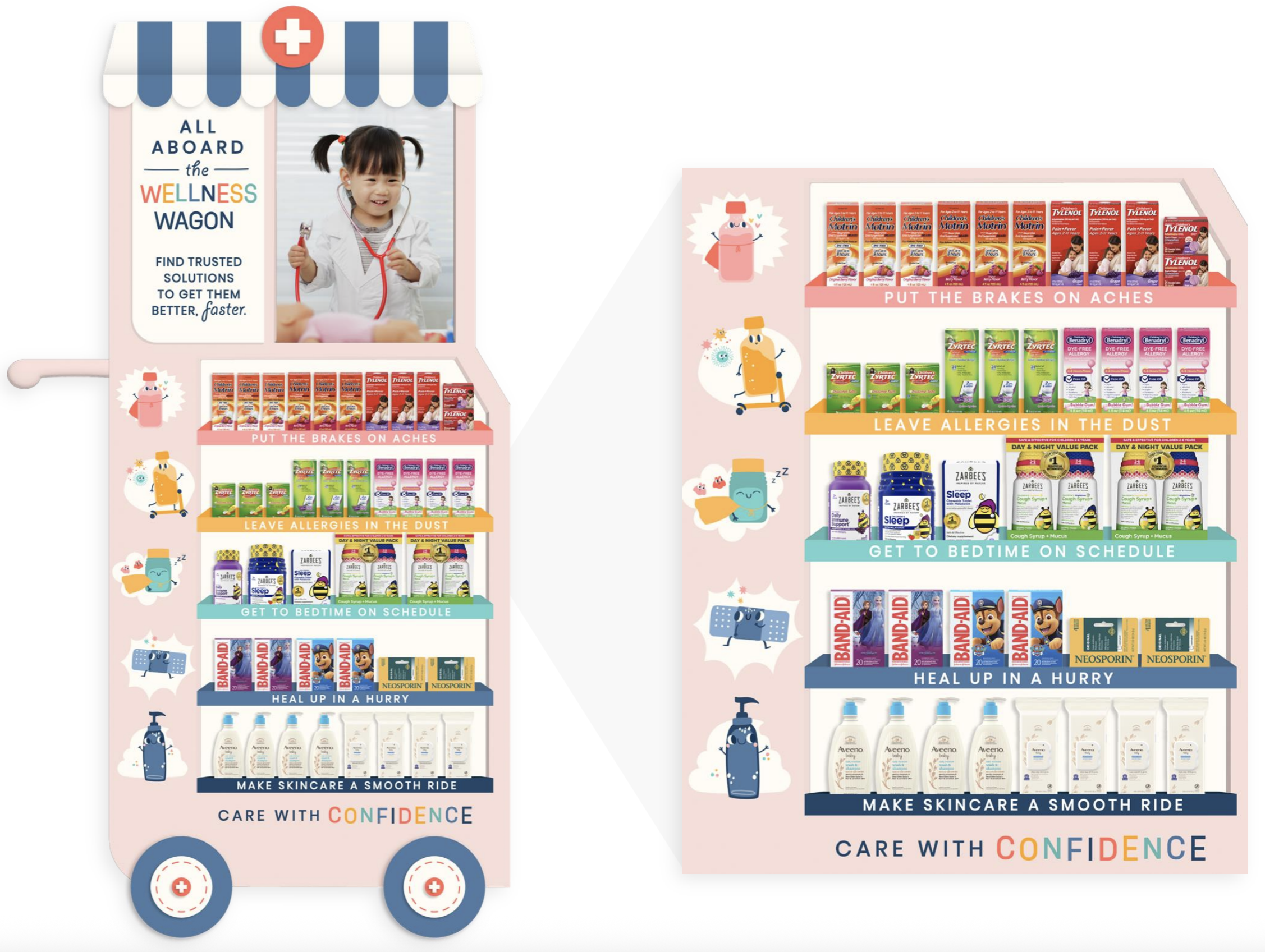
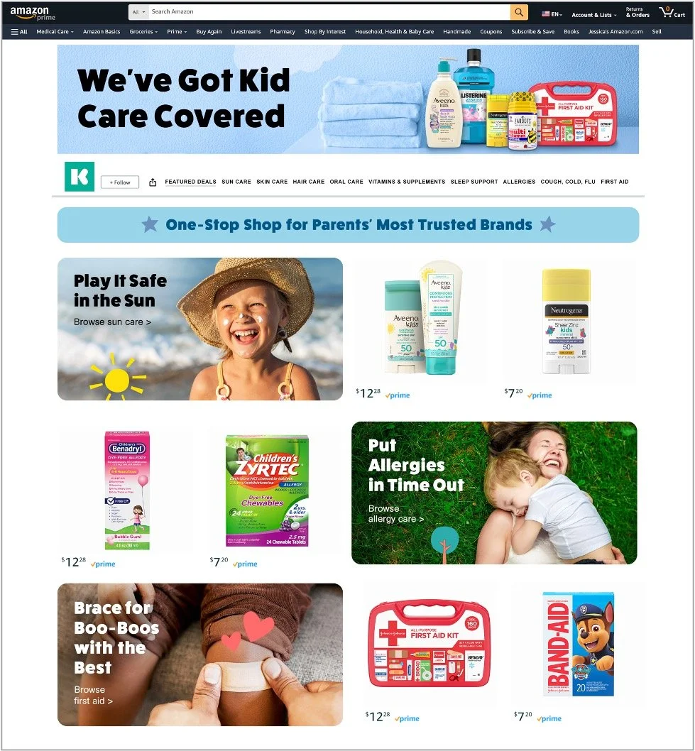
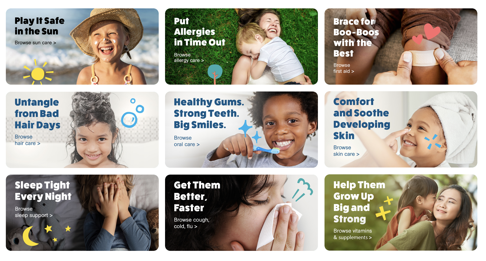
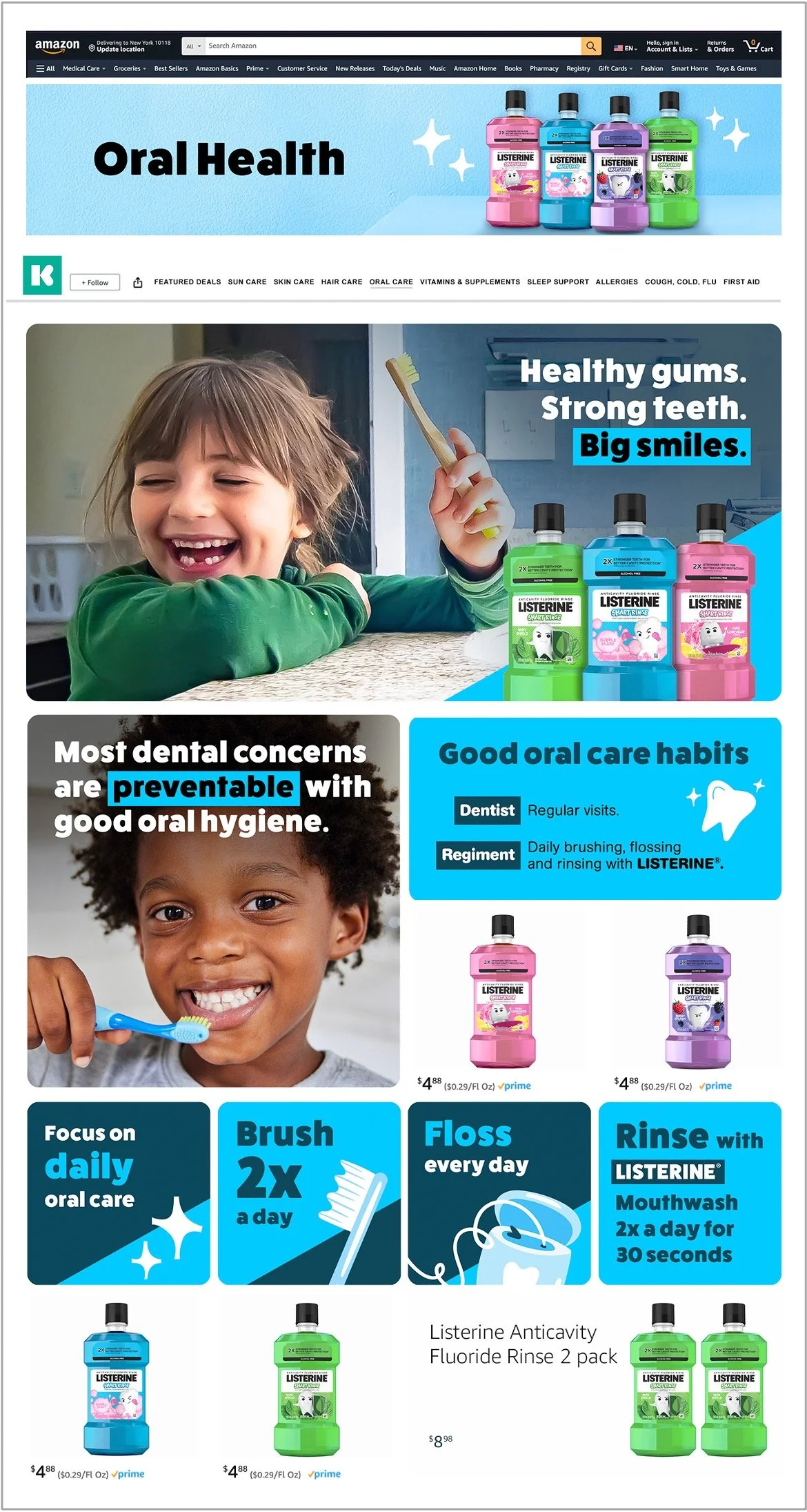
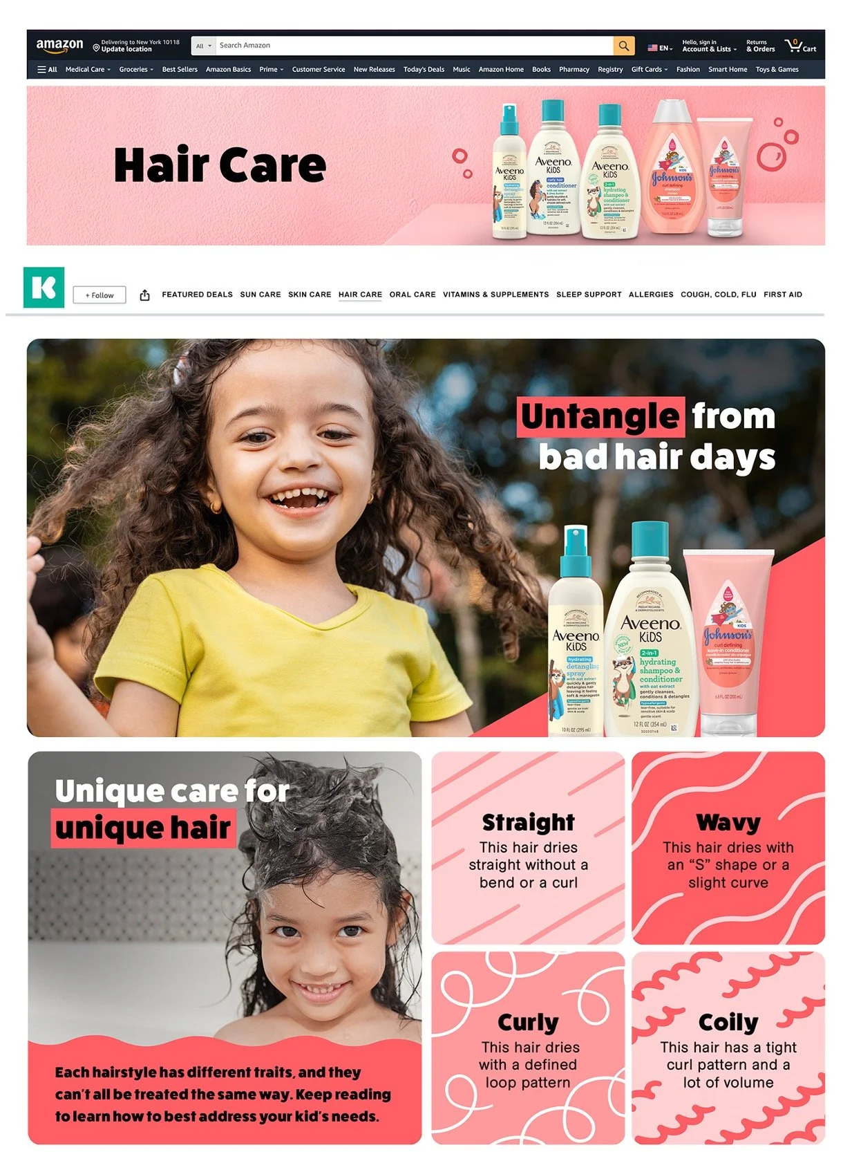
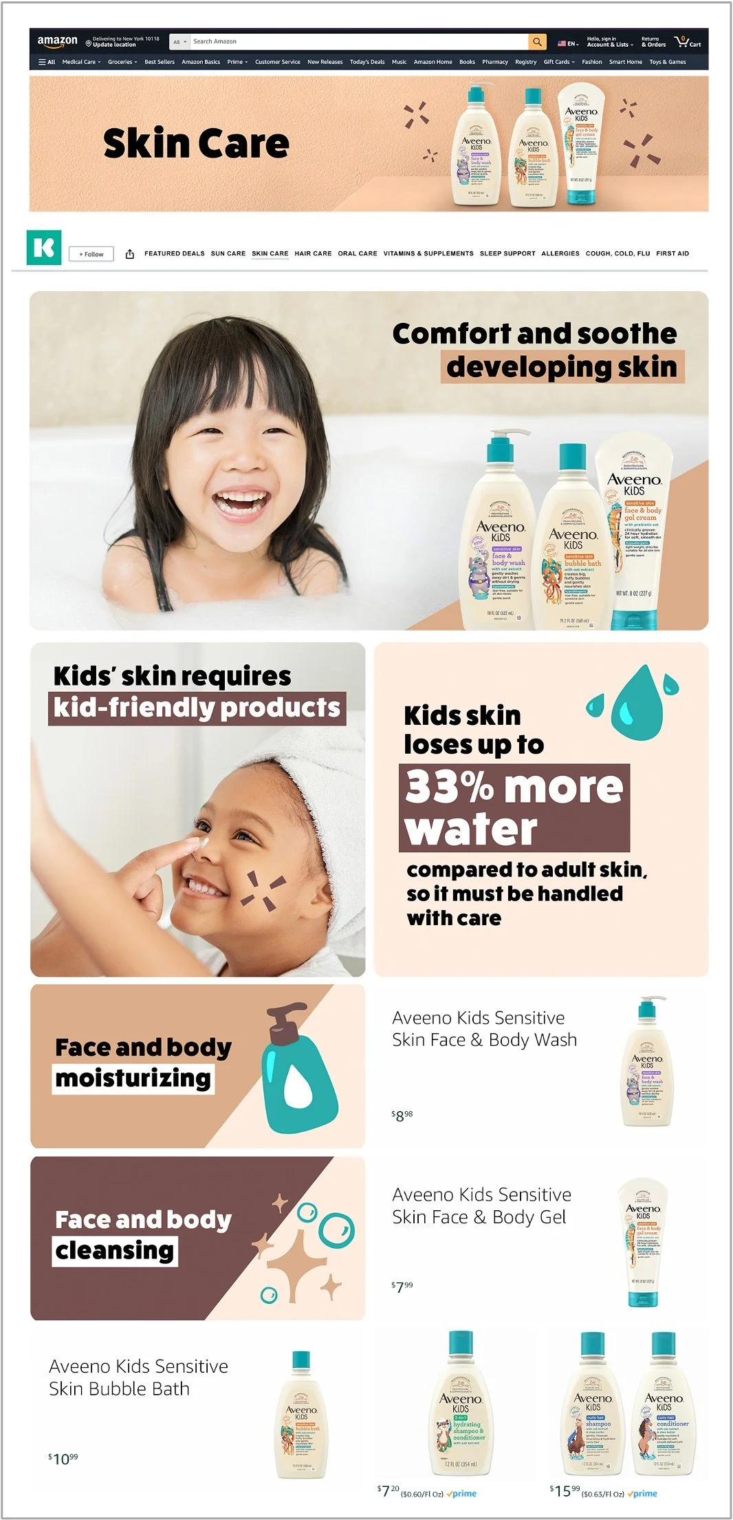
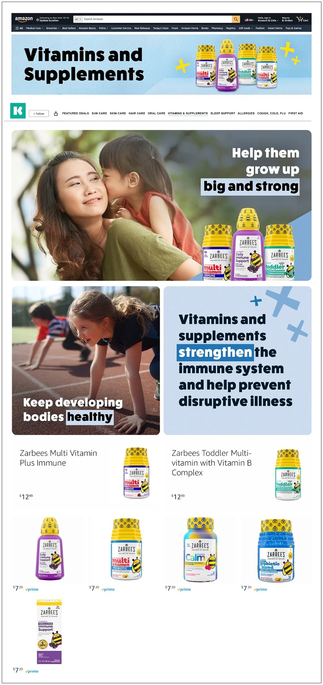
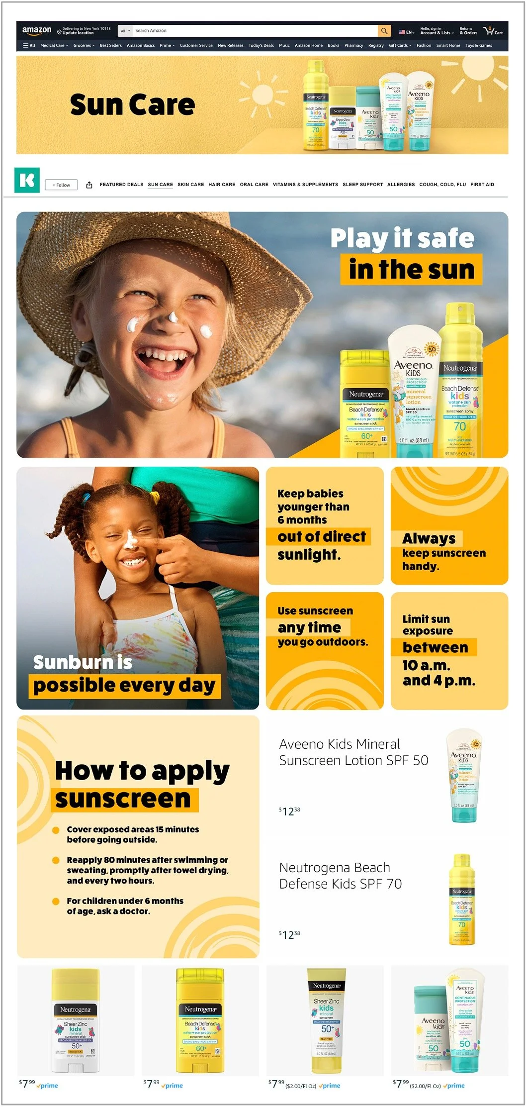
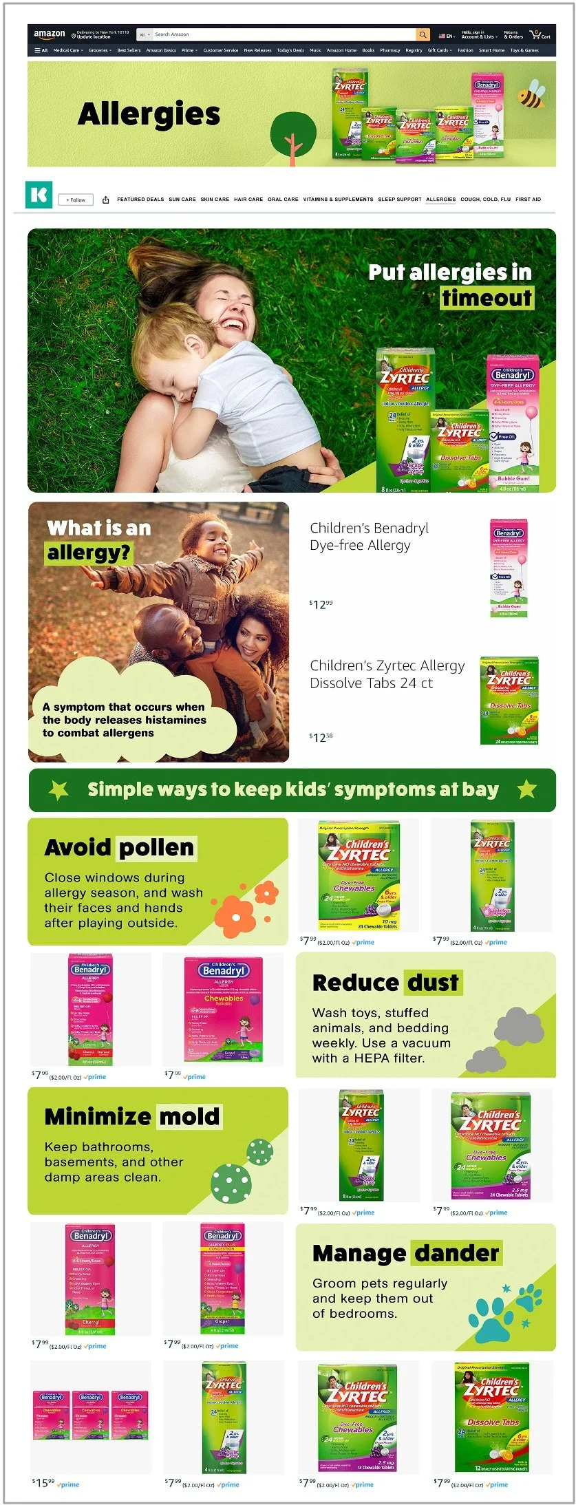
Kenvue also has entire lines of products entirely dedicated to childcare. This work tends to present plenty of opportunities to have a little fun. Like this.
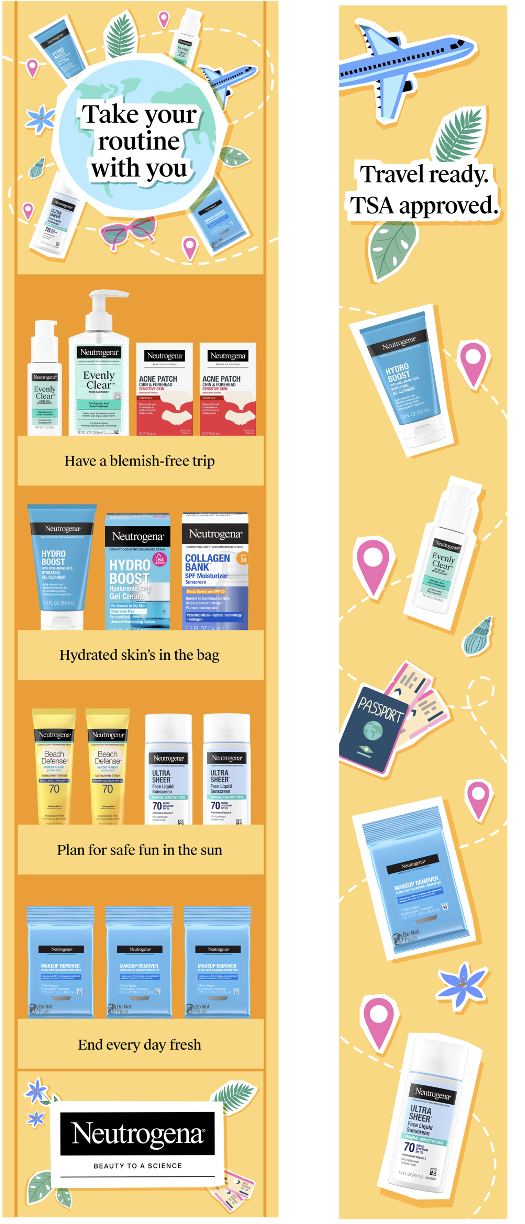
Within this category, we also did an Amazon brand page, in which the client wanted to incorporate product education. So for this job I served as both creator and editor, to ensure the educational content didn’t bog down the end goal of conversion.
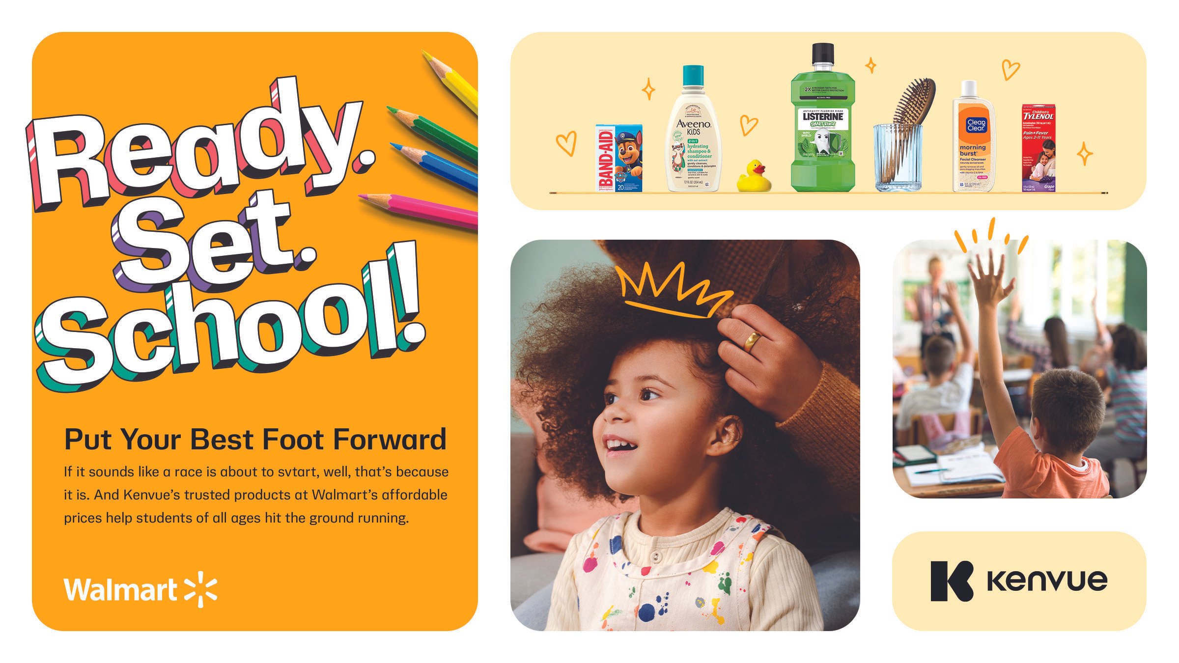
This ask was to deliver an umbrella thematic for a back-to-school campaign. We provided the client five conceptual territories to choose from before we started development. They selected Challenge.
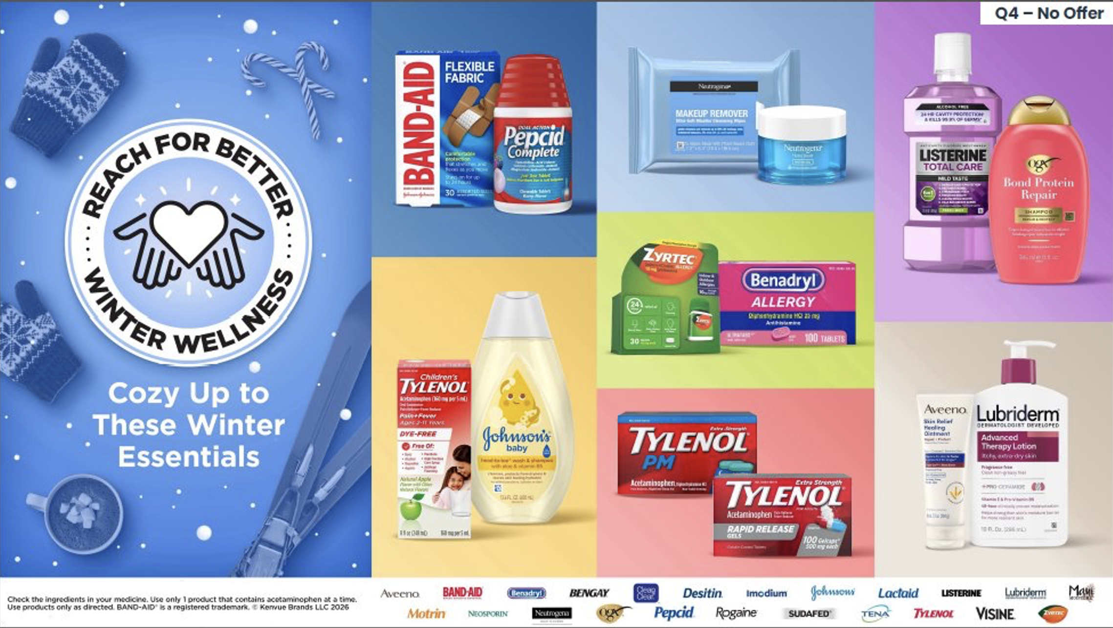
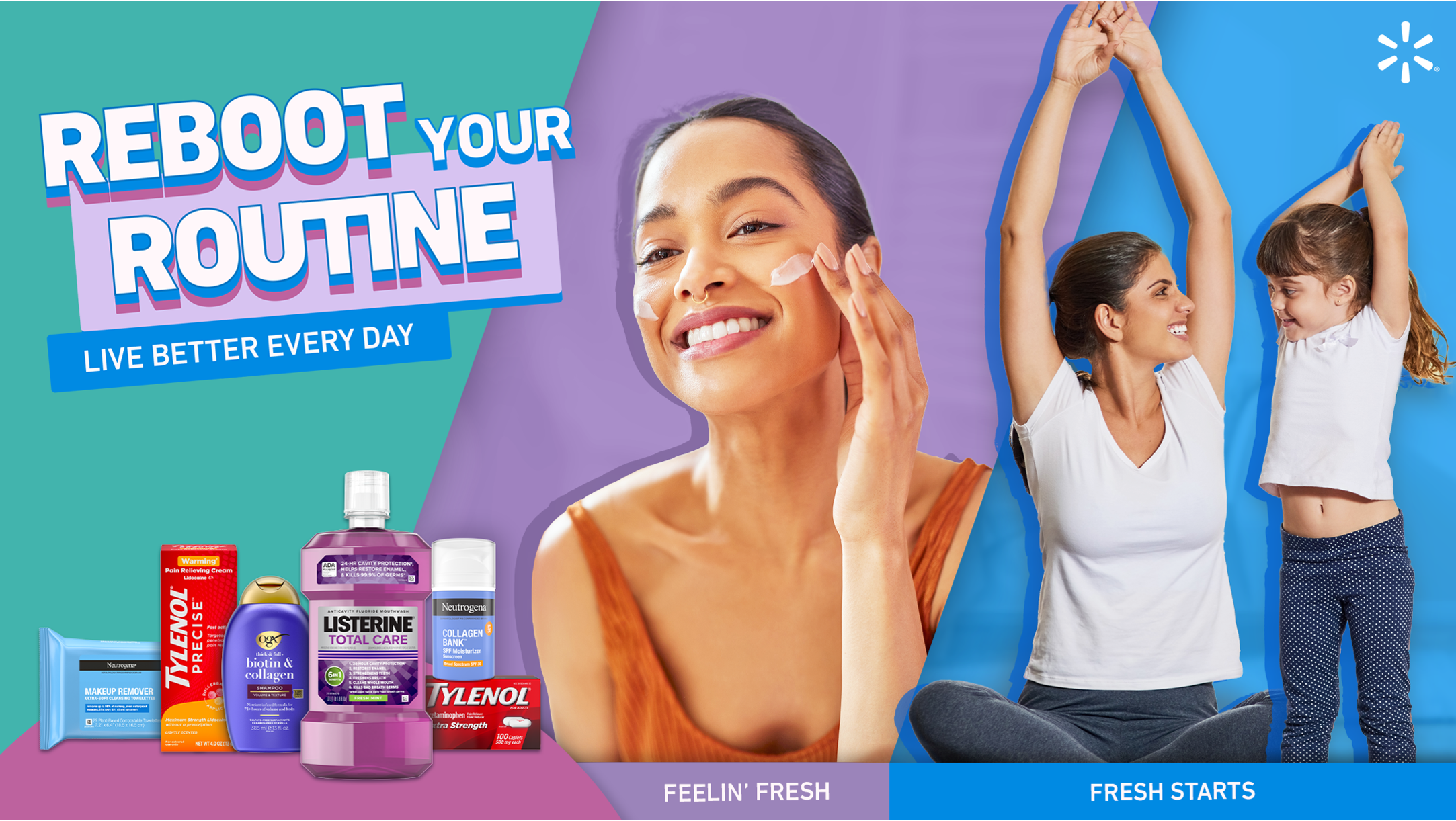
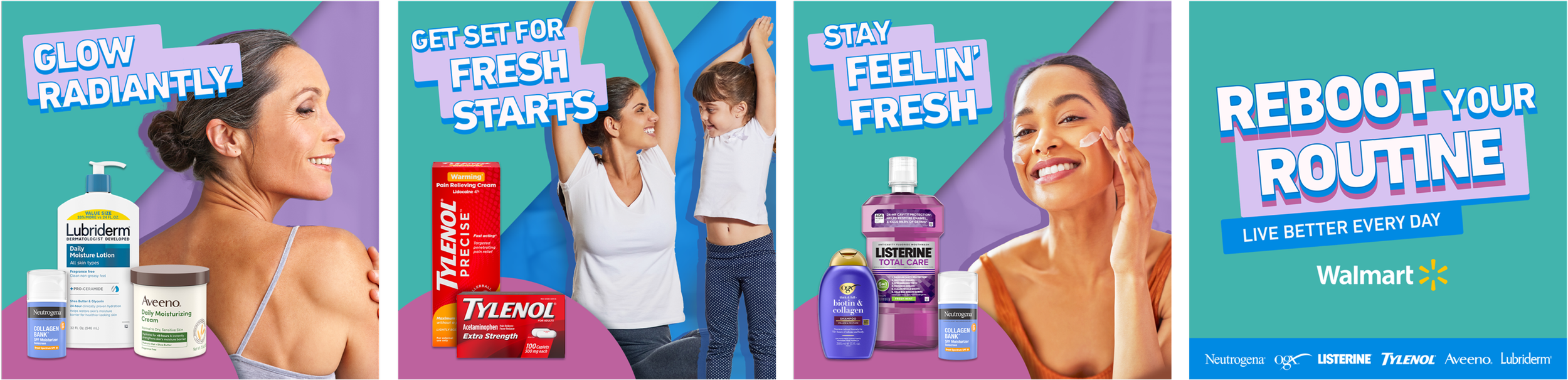
Next, we have a similar ask for the New Year occasion, inspiring Walmart shoppers to start the year healthier — without saying ‘healthier’.
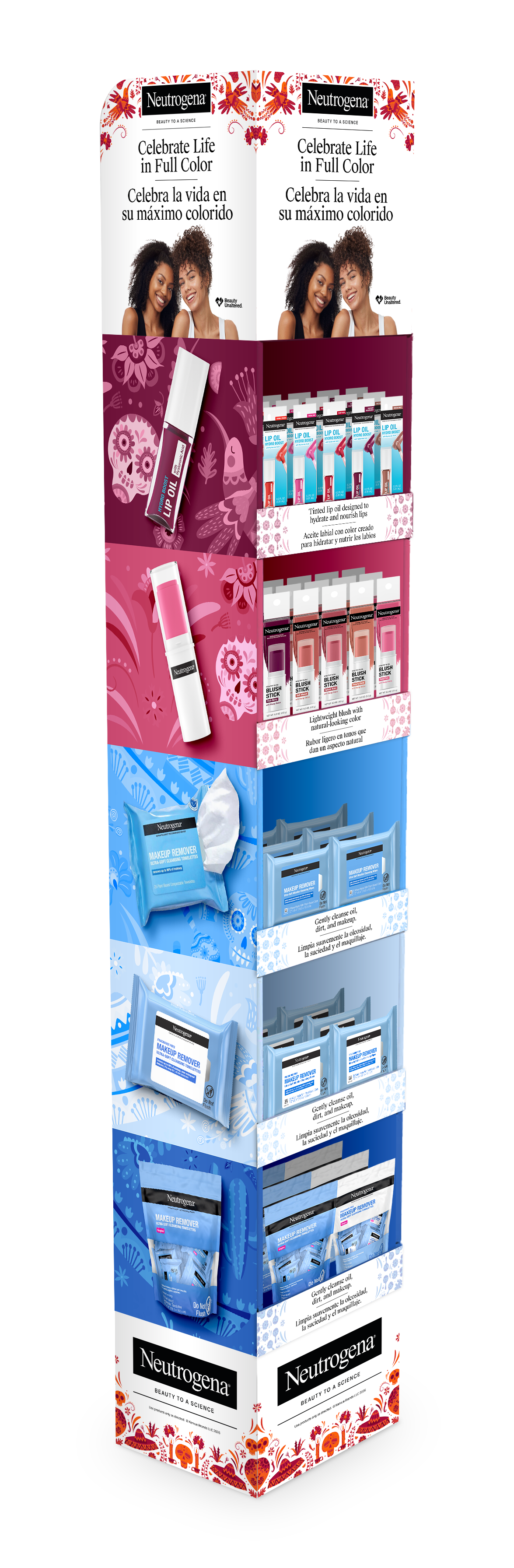
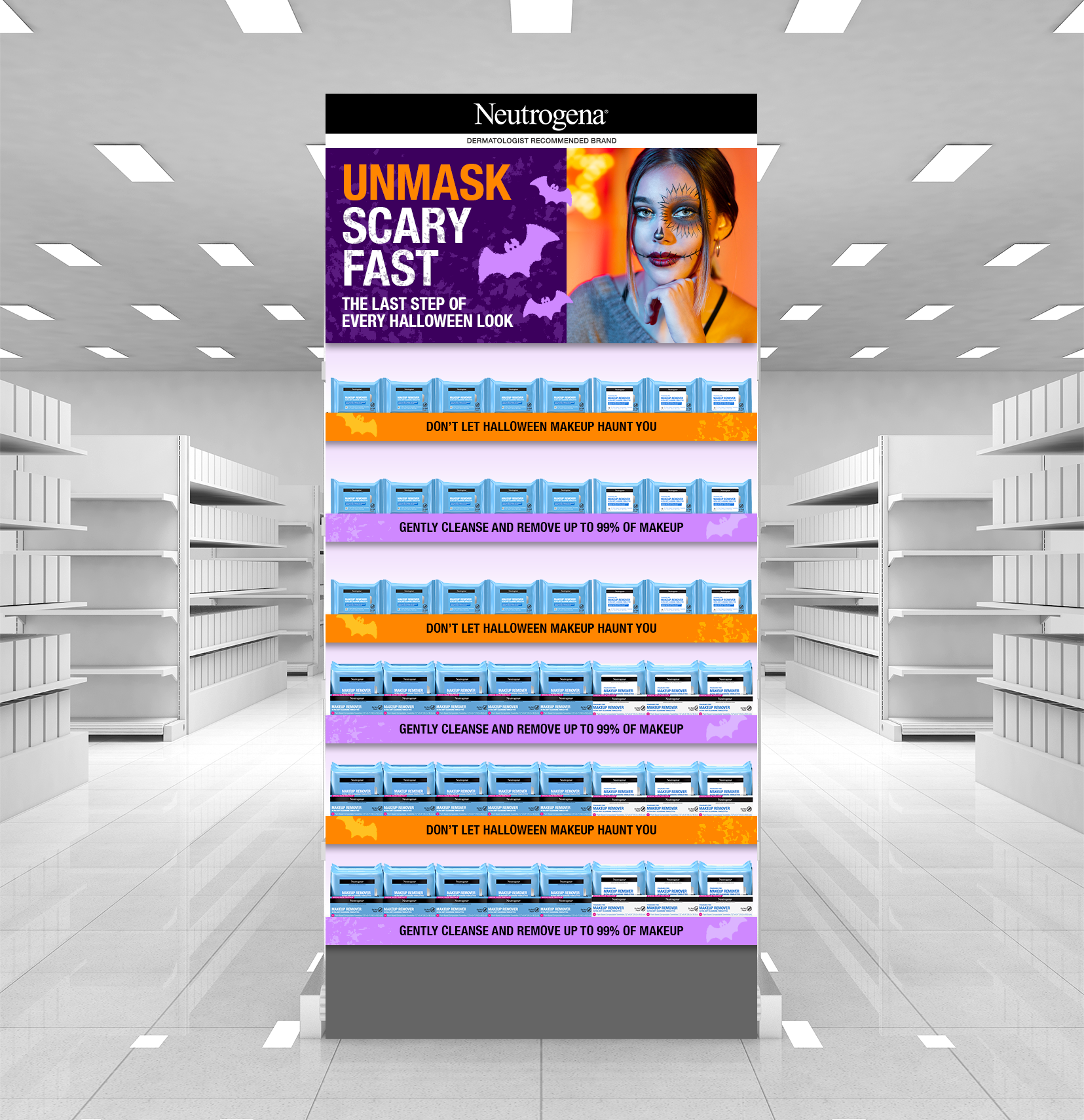
This originally started as a sell-in banner assignment. Kenvue found an opportunity to pair their makeup wipes with the Halloween supplies on Walmart.com and wanted us to help them naturally bridge the products together. I gave them this line, which resulted in two wins. One, they started specifically asking for “Drew copy”. Two, the following incremental display.
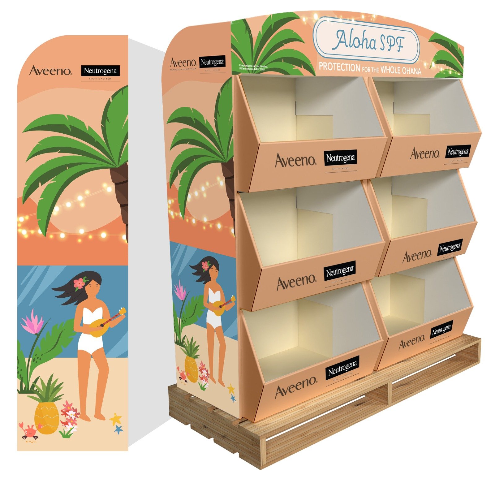
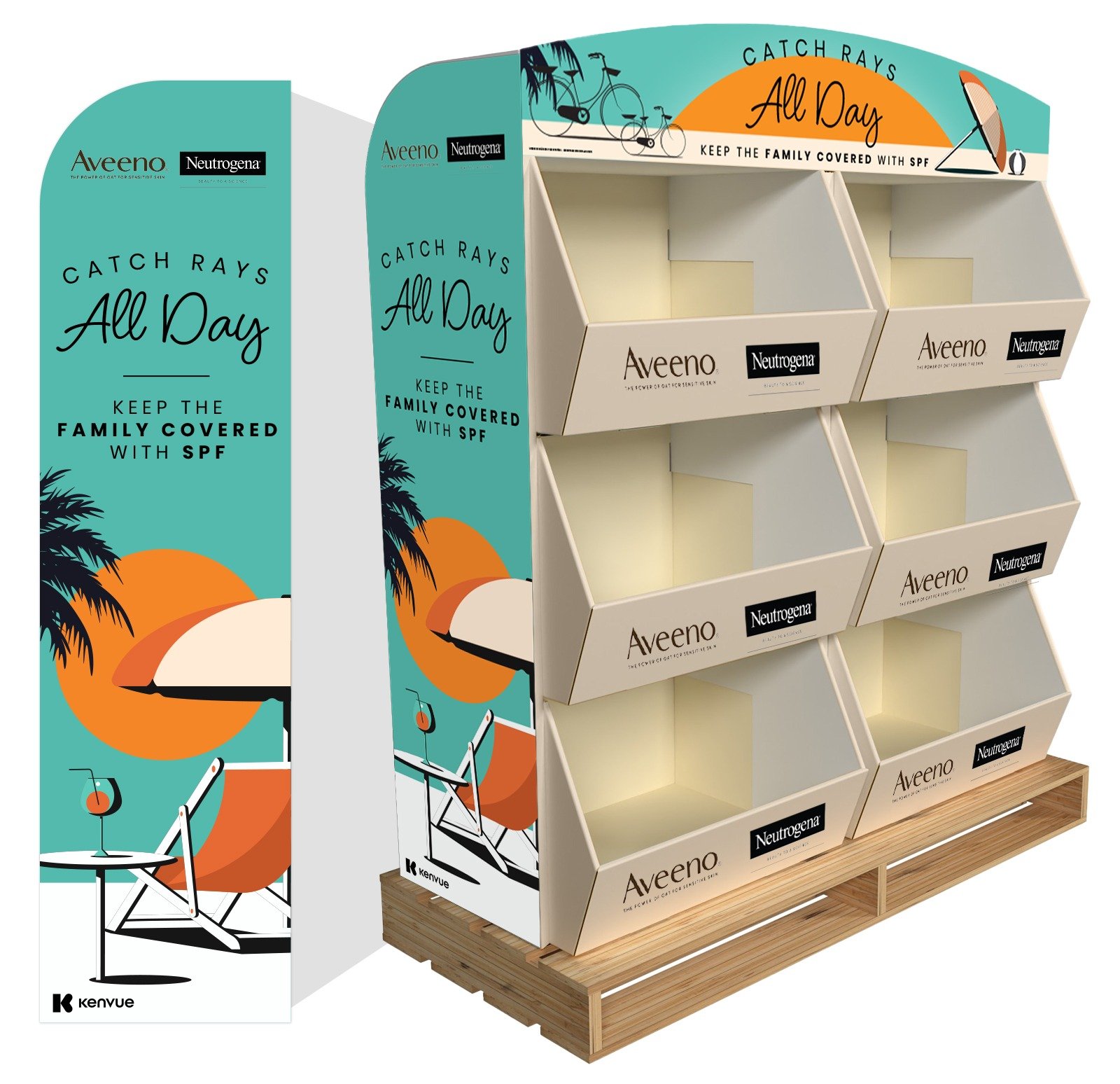
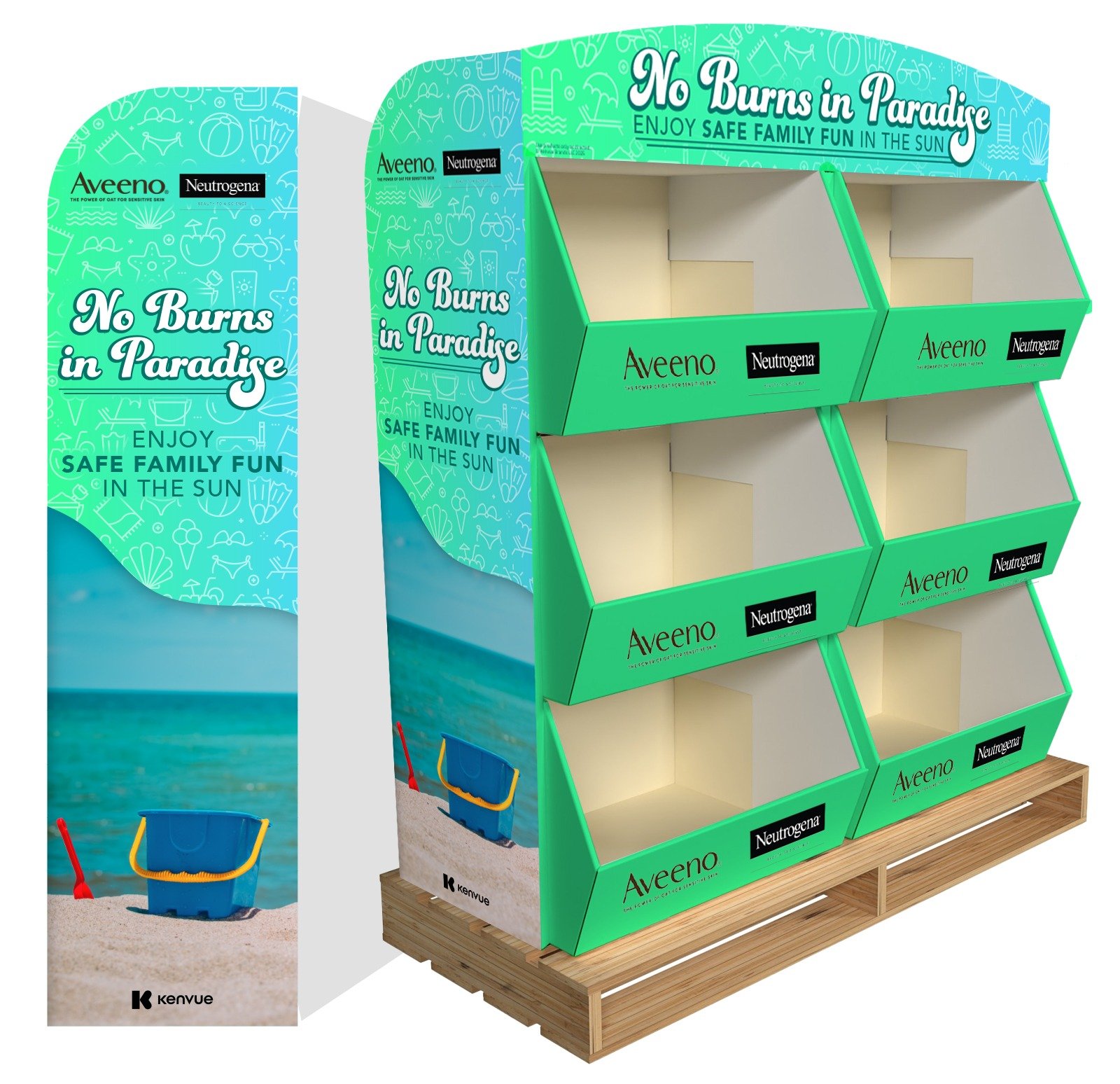
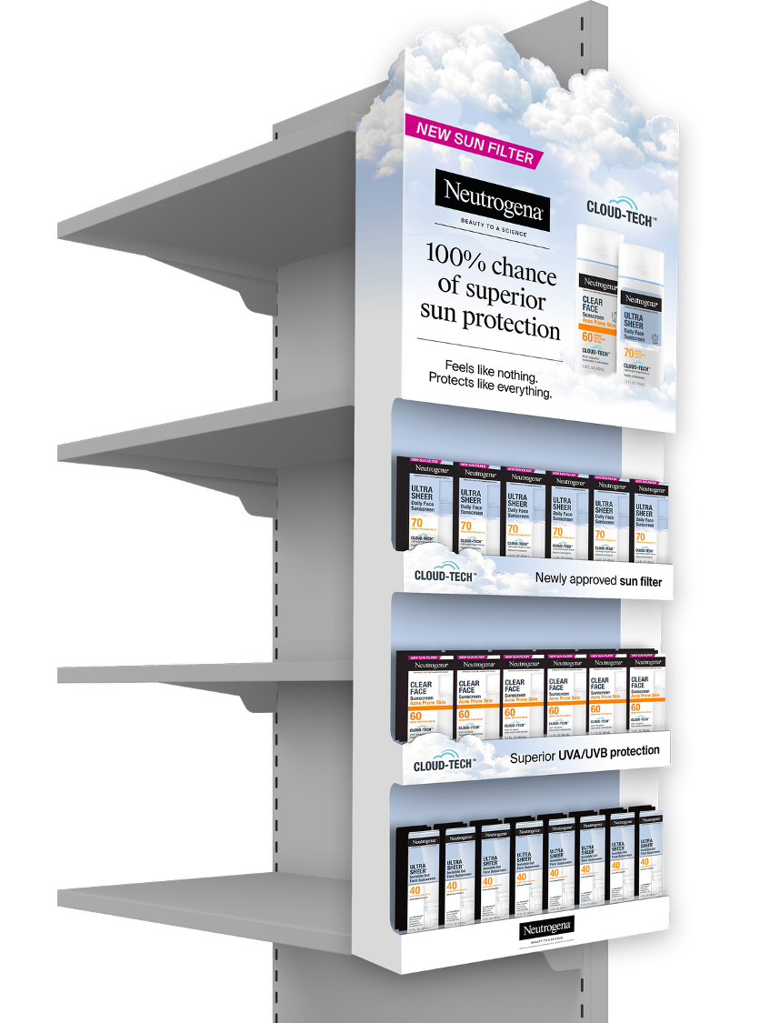
Wrapping things up with some additional displays where we got to have a little fun.