(There’s actual advertising after this, but I wanted to start with my favorite artistic accomplishment to date)
It took me a while to realize it, but my tattoos were my first taste of creative direction. I put together a mood board, decided my art style (specifically asked for ‘dark colors that pop’), had a general aesthetic in mind, hand picked artists whose skillsets fit what I was looking for, and collaborated with them to make something incredible. I finished my sleeve in the summer of 2018 and it still regularly gets complimented as an incredible tattoo. I’ve had more than one person say it’s the best Batman tattoo they’ve ever seen.
I’ll let you be the judge of that.
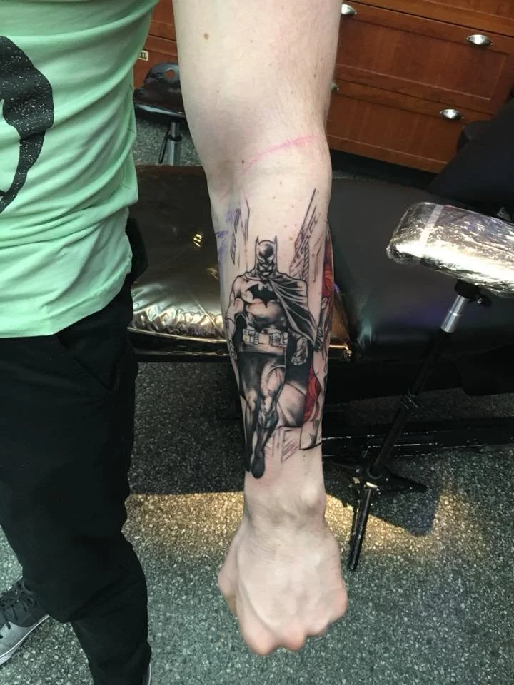
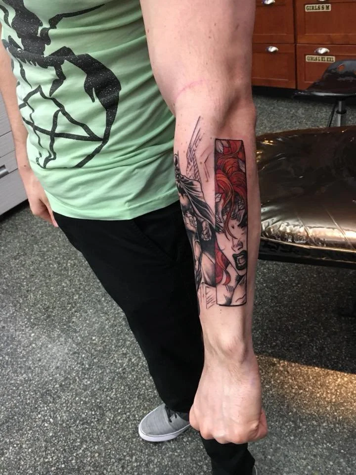
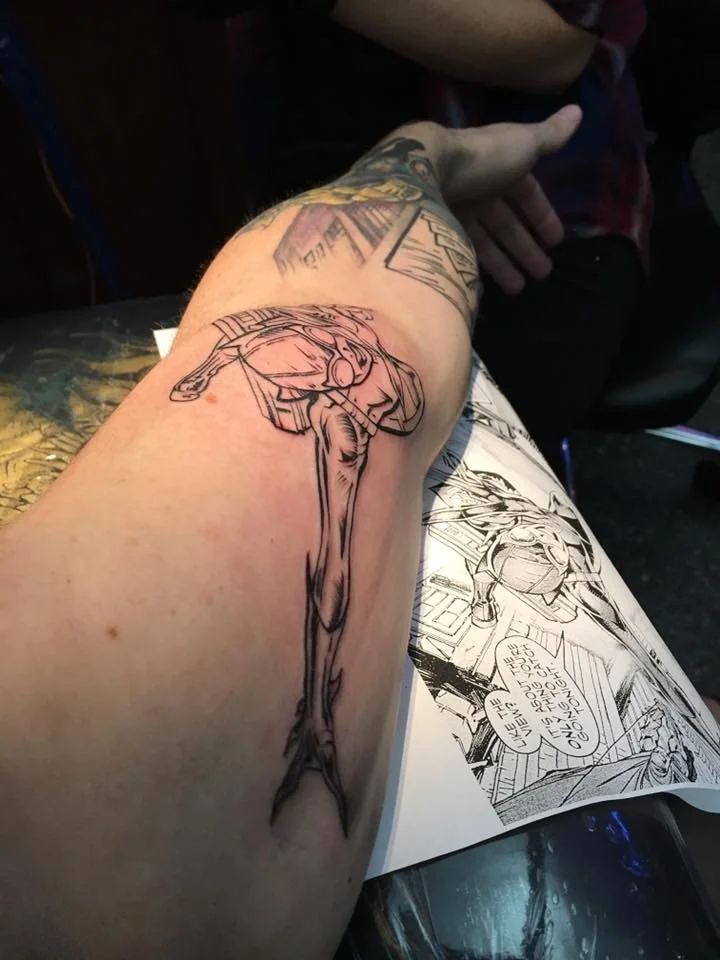
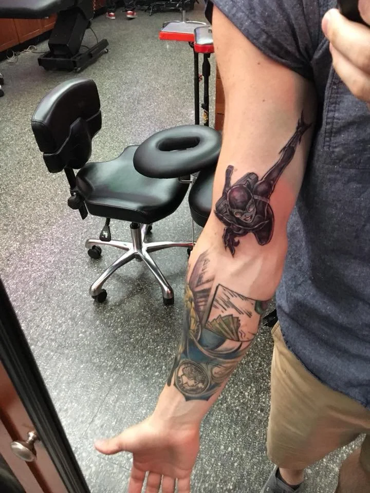
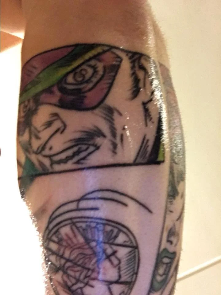
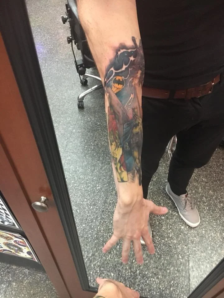
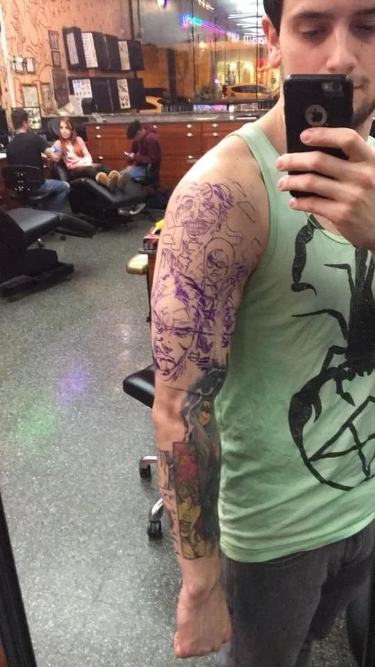
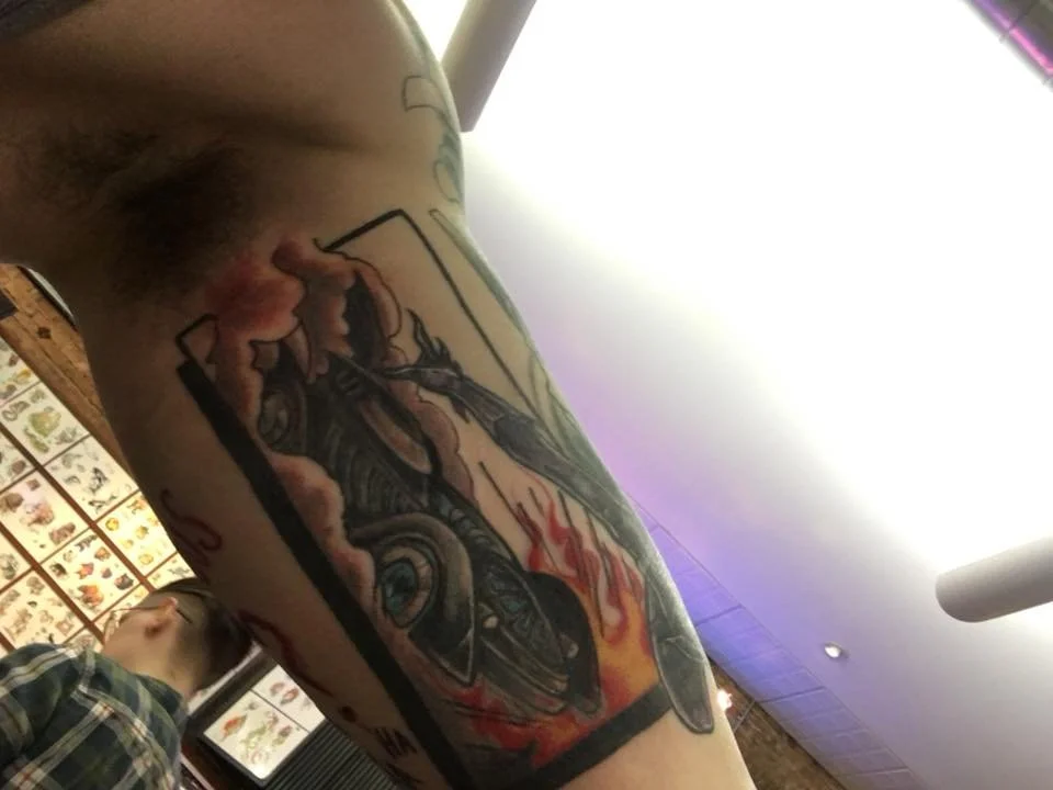
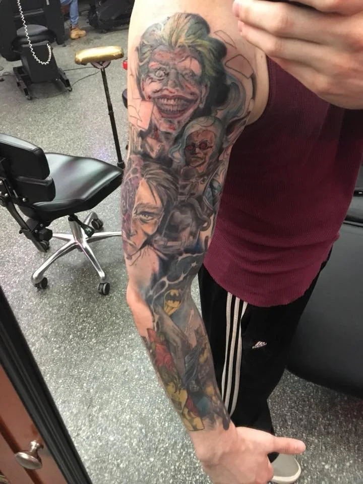
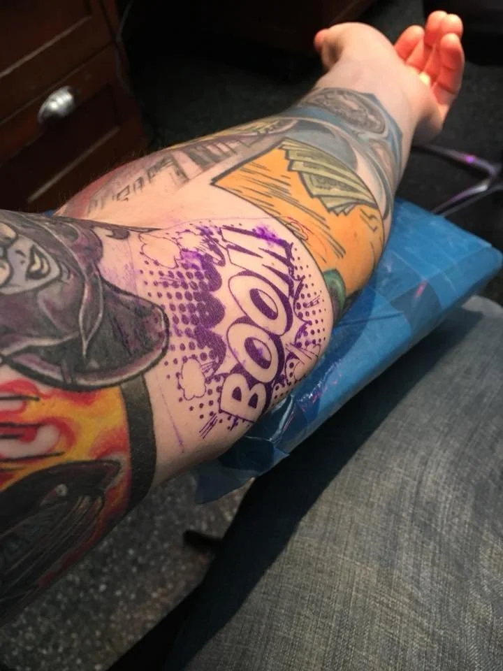
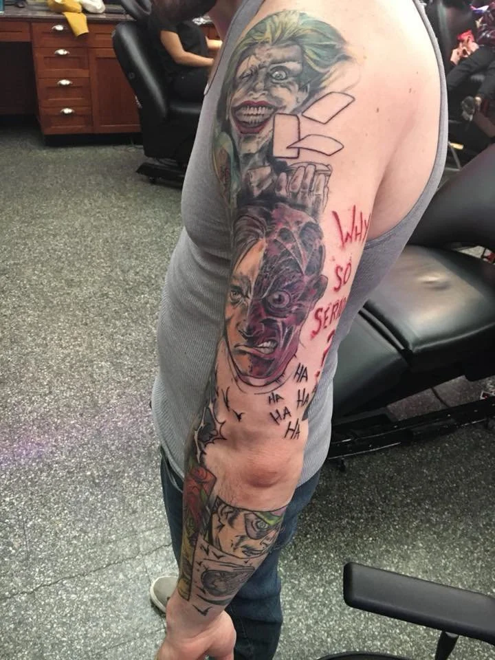
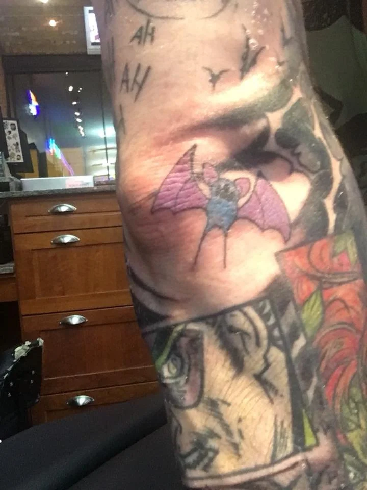
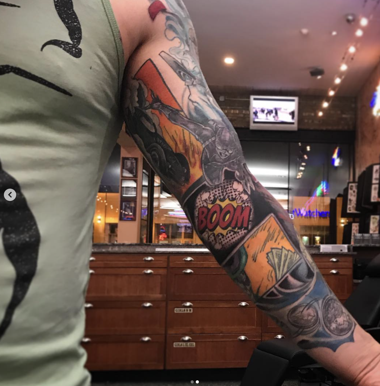
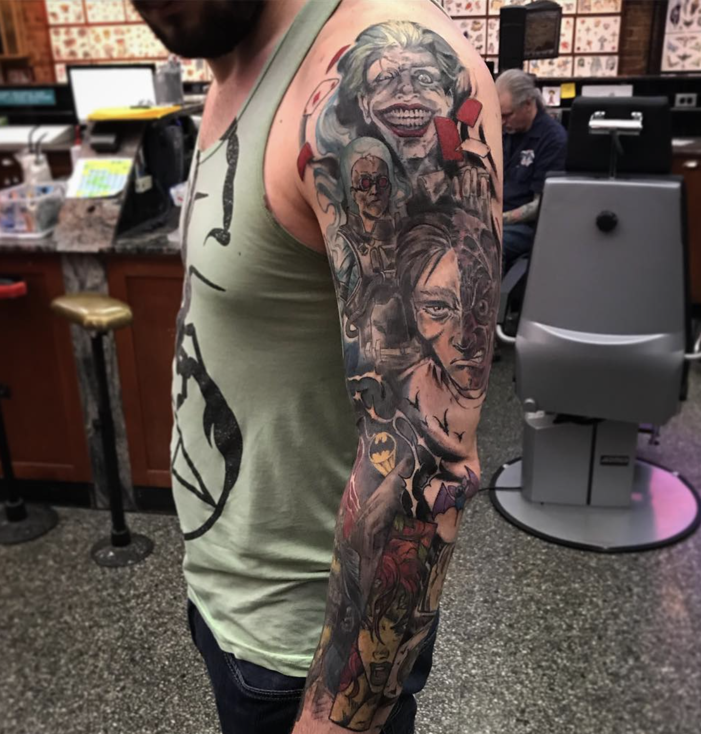
What I loved and love about this sleeve is that, outside of the general idea, we didn’t have a ‘plan’. My artist’s tattoo style is much like my writing style. No outline. Do what feels like it should go next and see what it looks like at the end. When it’s all said and done, it looks like the final design was the idea from the start.
Now back to advertising. In my first opportunity to teach my own class at book180, I wanted to give my students the brand that I felt like launched my own career ascension do to the fun inherently baked into it and all the possibilities it presented.
Cap’n Crunch.
I gave the class a handful of options for strategy, from selling to parents with kids, adults who think cereal is for kids, and adults who like to let out their inner child. This group chose the latter. They came back with the nugget of a Cruncheasy, and I directed them from there toward an area I think more junk food brands should be trying to capitalize on.
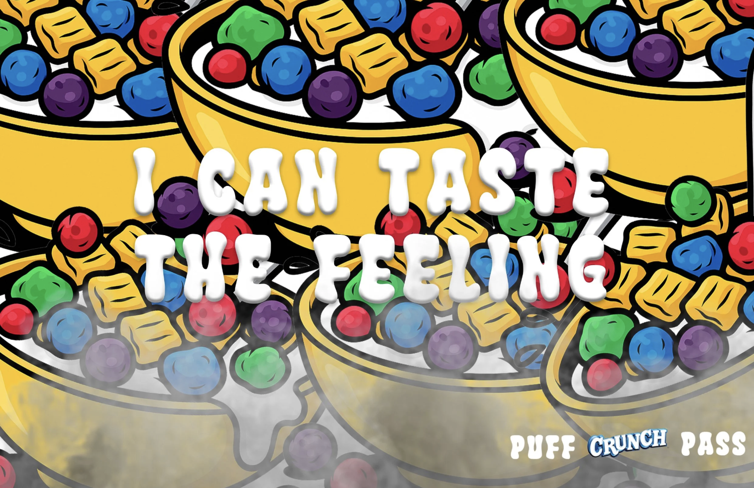
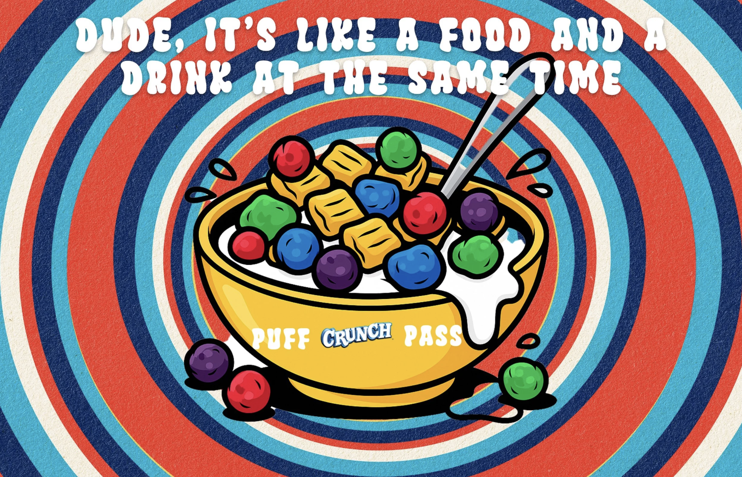
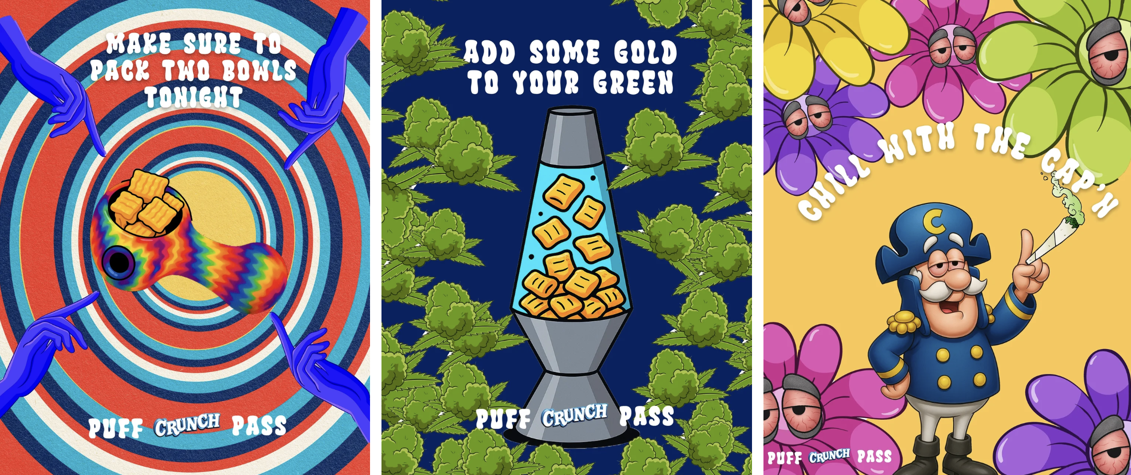
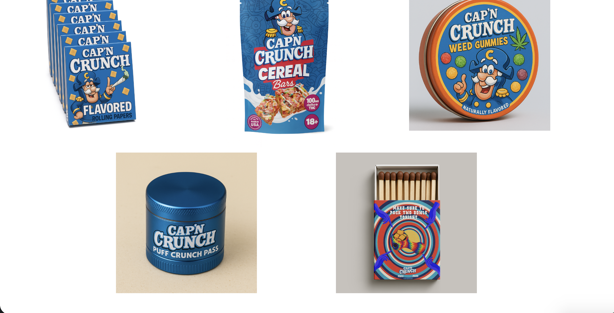
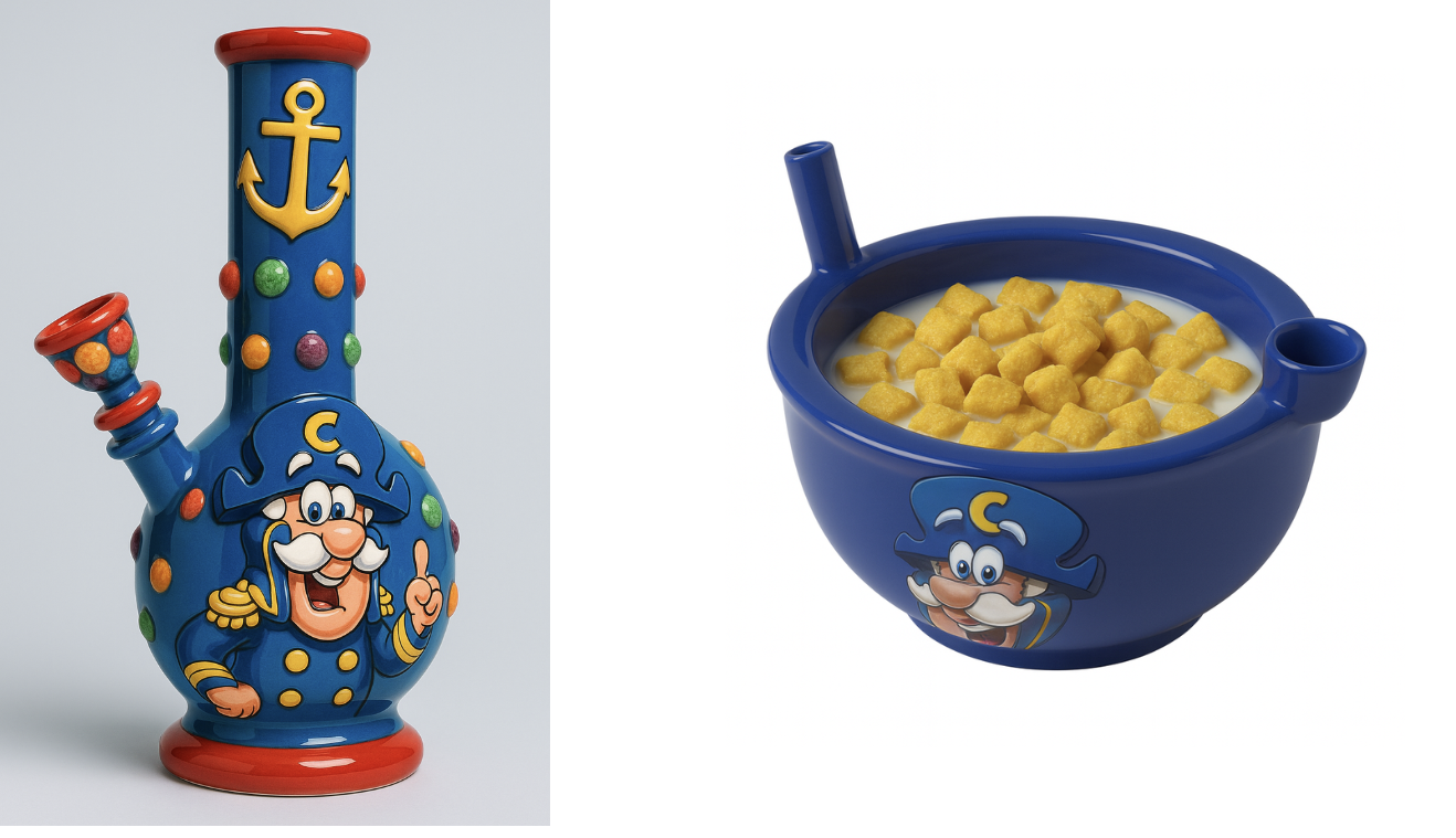
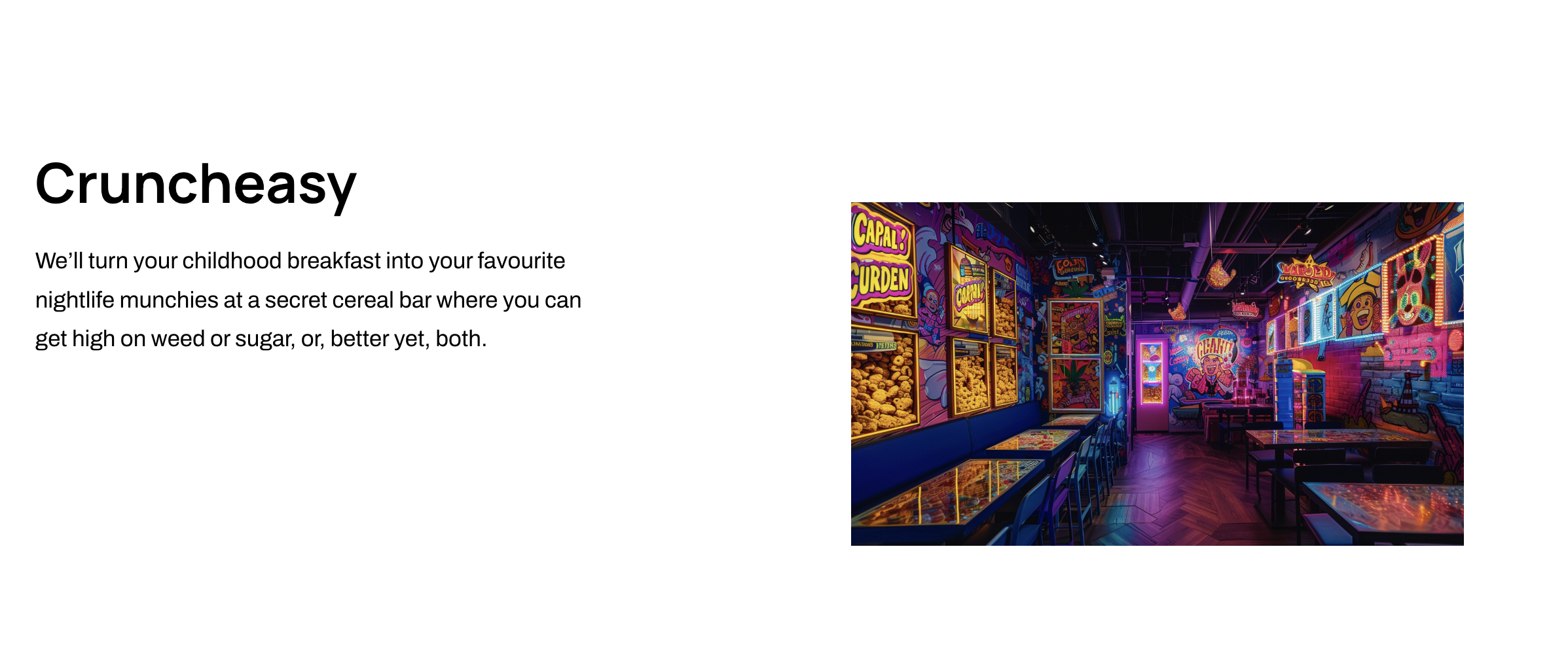
One of the bigger impacts I made in this campaign was when they said they were considering new lines besides “Puff. Crunch. Pass.” I told them that under no circumstances were they to do that, then turned it into a teaching moment. I asked the class “Why is this such an effective line?”
I couldn’t have written a better way for that to be answered.
Student 1: “Because it builds on ‘puff puff pass’?”
”Yes. What else?”
Student 2: “Because it only uses three words with a strong cadence?”
”Yep. But there’s one more thing.”
Student 3: “Because Puff also speaks to the form of the product?”
Bingo.
It was one of those rare lines that hit everything you want a campaign line to hit. Product specificity and ownability. A perfect encapsulation of the concept. Speaks to a specific human behavior and puts a branded spin on a well-known phrase. And on top of all of that, it’s a call to action.
I’m still incredibly proud of the team for how this one turned out.